EWALD KLAUTKY
Friday, August 26, 2016
Illustration in the Graphic Style.
Another piece done in traditional airbrush (model - Thayer Chandler) in a flat graphic-style back in the day. Gouache was used at the time. It was the preferred medium that was easy to clean but very delicate on the cold press illustration board. If you landed a drop of water on it, it would leave a ring of saturated colour that was impossible to get out. You basically had to mask the section of artwork, lift the paint with water from the board, & re-paint the section. The art was to be an advertisement for the Detroit Zoo and was one of the first paintings I did after completing the colour theory class. Ahhh, the good ol' days!
Friday, April 29, 2016
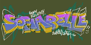
Graffiti Style!
Sometimes, I'm requested to do art outside of my normal commercial field of entertainment. This was a Birthday present for my nieces in Ohio. I call it "Graffiti Lite". Real street artists would be critical about it but I didn't copy any of it from existing work. It's strictly my own take on the style.
Wednesday, October 21, 2015
Kamikaze!
This year, I find myself in an unfortunate position where I won't be able to attend the upcoming Kamikaze event in downtown Los Angeles. It's a great event venue in which you can advertise your talent & professionalism along with other talent and enjoying the show itself in the world of comics, graphic novels, animation, film and games. I also missed the San Diego Comi-Con for the last several years. Hopefully, this will change soon and I'll be able to attend future events.
Friday, August 28, 2015
Pitch Boards!
Pitch boards, also known as beat boards, capture the story beats or highlights of the story and sometimes convey the art direction. This particular assignment done 20 years ago was an interactive beat board with an alternate ending.
Saturday, August 1, 2015
Thursday, January 15, 2015
Selective Markets.
These days I find a lot of little freelance gigs once in a while that tie me over the long production hiatuses and off-semester teaching at the college. I've been teaching at Santa Monica College for a number of years now & look forward to working in the professional field again. This was part of an on-going series pitch for a select children's show market for ages 7 to 11.
Tuesday, October 28, 2014
Halloween 2014!
This was a pen & ink done in my sketchbook. It was really an exercise in getting comfortable with the brush pen and use of line weights. Once you start a good inked drawing, you want to make it consistent by not making mistakes. You can never erase it afterwards. The signature was added in Photoshop.
Tuesday, August 19, 2014
Horror Movie.
Horror movies shot in Asia do well in DVD sales or in certain cinephile circles globally. Vietnam is no exception. I'll have to follow up with this to see how or if the 550 plus boards were used in the production of the film. Photoshop was utilized in the creation of the key frames with dialogue breaks for the director to follow the audio portion as well.
Tuesday, August 27, 2013
Another Prop.
I like designing models for animated shows. Besides storyboarding, it's a challenge and a pleasure. This was from the X-Men Evolution series that ended in 2005.
Tuesday, June 18, 2013
Greeting Card!
Friday, March 29, 2013
Drink & Draw Style!
Careful not to label a "style" that's been copyrighted, I've admired the look and its effect on a page. I used recycled paper for this drawing. First, the pencil, then the ink, the whiteout pen, and finally, the Prismacolor pencil to blend.
Tuesday, January 29, 2013
Thumbnail Sketches.
These storyboard thumbnail sketches are drawn in approximately 1" x 2 1/4" size frames. I was just experimenting with action sequences and needed more action boards in my portfolio. Photoshop added the tone over the pencil drawings. I'll continue the sequence at a later date.
Sunday, January 27, 2013
Assembly Line.
I did a couple of drawings dealing with robots & assembly lines awhile back. They were done in black and white with pen & ink and later with Photoshop added to punch up contrast. I used the same interiors for a Lotus Elise car ad later.
Saturday, November 17, 2012
An Old Painting on Canson!
Painting on paper presents the challenge of using less water to avoid warping. I did this in my final year in art school to do a more opaque application process. I loved the challenge of it. And to test my colour theory knowledge.
Friday, September 7, 2012
Acrylic On Canvas Board.
The first Sunday of every month there's Life Painting at Paintlab in Santa Monica. Approximately 10 x 14 inches, the painting was part of a 3 hour session. I managed to block in the form in that time. I added some gradient effects, adjusted curves & contrast, increased hue saturation, and added warm highlights in Photoshop later.
Subscribe to:
Posts (Atom)


